Time travel
29 november 2005
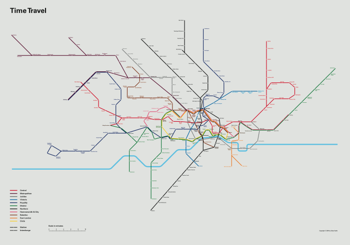
Map in photo above is a part of one of my final projects I did for my last school, London College of Printing (now London College of Communication). It was an attemt to redesign the London Underground map. In the beginning when I didn’t know what to do with the project, I called it ”impossible mission”. How could I come up with some innovative ideas to this piece of design that is by many considered as one of the best in graphic design ever?
Well, I knew couldn’t just do a normal re-design; something had to be added. I started thinking what’s different in the world now from when the map was designed and one thing that are different today is time. No one has any time left any more. Time is money. Time is everything and so on. Today you never tell anyone how far away in miles you live, but in minutes or perhaps hours if you’re unlucky. So I decided to create a re-design based on time instead of distance (normal maps) or simplicity (tube maps). By combining geographically accuracy with simplicity and time I started out with measuring the time it takes to travel between each station in the whole system. After that I started drawing in Adobe Illustrator but I didn’t get far – It was too complex to draw on the map. I needed to do it all by hand, so I cut out strings of paper in different colours and lengths (depending on distance in time) and started modelling (image below, and above). The modelling was very complicated since there are so many lines in London and they have all different trains (=speed) and amount of stations which made it very hard to connect all lines, but after weeks I finally ended up with an OK version (image above).

When the analog bit was done, I photographed the map, scanned it and put it in the background in Illustrator. This time it wasn’t as hard as the first time to draw. The problem now was how to display all lines and stations intersections in a relatively new way and not just a copy of the original designs. I found a design system and also finally a typeface (Univers) that I think worked well.
Next step was to create a new type of background zoning system. This would be measured in, of course, time too. Since my school was in Elephant & Castle, I put time 0 at that station and then I created zones for each 5 minutes travel from Elephant & Castle. The idea is that the background is different on each station around the system.
I also wanted to change the colours to more releveant colours. I looked into the wavelengths of different colours and based that on the average speed of each line. Central line was fastest and Circle line slowest.
Below are images showing the process of drawing the map in Illustrator. The close-up one is showing the area around Kings Cross.


This is the final map focused on Elephant & Castle. The scale in the bottom left is a time scale, in minutes. Each zone represents 5 minutes.

This is the final map without zones.

Download map in pdf format:
timetravel.pdf
timetravel_no_zones.pdf
UPDATE
By popular demand, I have made another version of my map and used the same line colours as the original tube map. Enjoy!
timetravel_no_zones_old_colours.pdf
Jag undrar — kom du till nån slutsats med det här? Jag menar, jag gillar projeket för dess galenskap men utgångspunkten måste ju ha varit att försöka addera nånting för att föbättrea systemet — eller? Hur funkar din karta i jämförelse med den befintliga, vanliga vi är vana vid? Har du testat den på annat folk som inte vet skillnaden, kanske rent av folk som inte är vana vid London? Det skulle vara intressant tycker jag, om inte annat för att knyta ihop hela projektet.
/Peter 2005-11-30, 03:22
Ps. Din klocka går fel. Ds
/Peter 2005-11-30, 03:32
This is interesting, though it’s not at all intuitive at first glance. I would love to see a version linked to a db of travel times that could support interaction. For example, you might have the tube map with clickable stations, and clicking a station re-renders the timezones to reflect that station as the origin. This way, you would have an interactive map that estimates your travel time between any pair. Perhaps this is too complicated to draw… it would be neat, though. Cheers…
/cbg 2005-11-30, 15:11
An interactive version would certainly be interesting. Especially if the map were to update itself with the service status (so stations get really, really far away when there’s a blockage) – although I realise that the dependencies for this make it reasonably impractical.
anyway – great work!
/Danski 2005-11-30, 16:19
Thanks! Yes, I’ve been thinking about interactive versions ever since I created the first version of the map, but i haven’t really had time/data to do something like that. I was thinking of some kind of flash interface with the features like you guys suggested. Had some ideas with a lot simpler version that only showed the distance from the selected station to all other stations in time and the actual ”compass angle”. It could look something like this:
I have only included a few stations in this sketch but the active station is in the middle and each background field is representing an amount of time.
/oskar 2005-11-30, 18:07
Peter, I’m not sure if my map is so much easier to find your way around with – just because it became quite complex when all lines had to be connected without altering the distance(time). To be honest, I don’t think the original version is so good either, I prefer the maps that are geographically accurate, but that’s probably because I am such a map geek. I haven’t tested the map on anyone really but I guess it’s good if you want to find the fastest way somewhere, especially in central london where there are lines everywhere. Further out in the system you kind of know that it will take time and you accept it. I guess a map like this only showing the central areas would be good, but the whole point in the beginning was to show the people how f-ing long time it takes to travel around in London – it’s almost a joke! I hardly ever traveled by tube when I lived there, most of the times i cycled.
/oskar 2005-11-30, 18:14
And you changed the colours of the lines for what reason? Perhaps because you’re on crack.
And you made a ”time” map where the time delimiters are not of equal distance because… you’re just wanking and trying to apply a retrospective justification for that to get a grade?
Jebus. You set out a list of things you’re doing and then spectacularly fail at all of them. F. Try again.
/JH 2005-12-01, 03:56
I’d love to see this displayed comparitively with the original tube map and a geographic one – that would certainly help in understanding what the contribution is here.
Anyway – nice work.
/Matthew Hurst 2005-12-01, 12:32
Okey, I guess the project would somehow be more interesting if it was about trying to redesign the map and not just making a comment. But I guess that’s just me… Of course I still think it’s a very nice piece of work.
/Peter 2005-12-01, 13:08
JH,
Have you ever seen a topographic map? Are you complaining that the ”delimiters” are not equal distance apart on them? Even a 1st grader can figure out why the lines are not equally spaced. You’re an idiot.
Oskar, nice map. Kudos for trying something new. I agree that an iteractive map would be sweet. Every subway system in the US could use that (especially Chicago).
/Chris 2005-12-01, 15:08
Saw this on digg. Very cool.
/Jak 2005-12-01, 16:49
It’s impressive, the grey shaded version is cool.
I agree it would be nice to use the same colours as the standard map.
I also think it would become super popular if the grey zones could be generated on request, centered on a users chosen station, using an underlying database of travel timing.
Great job.
/Bill 2005-12-01, 16:53
Nice concept, nice execution, nice map. Well done.
Could you perhaps publish the journey times as a table?
It would be interesting to see if any of the readers here could come up with an interactive map, or even an alternative representation. (Perhaps one that merges journey time with geographical location? or other information, maybe?).
Now all we have to do is figure out how to integrate it with Google earth. ;-)
/Will 2005-12-01, 17:18
P.S. Have you heard of something called MDS (Multi-Dimensional Scaling)? It might be useful if anyone wants to have a dynamically updated version.
-Will.
/Will 2005-12-01, 17:20
This is a great effort to visually represent information in a more meaningful way that it currently exists. ET would be proud.
I have linked to you, via Digg – for a job very well done.
http://akakadak.blogspot.com/2005/12/mapping-london-underground-with-time.html
/Akakadak 2005-12-01, 17:22
wicked
/lulu 2005-12-01, 17:22
What a spectacular example of an innovative mapping project. I’m floored by the creativity and obvious labor of love you put into this effort. I hope you get some media attention for this! I think what some of the commenters don’t seem to get is that maps are supposed to help us understand the world visually in ways that are useful, but not necessarily familiar. This reminds me of the work of E.J. Marey, ”La Methode Grphique” (Paris, 1885) where Marey created a unique graphic map, which is, believe it or not, a train schedule. (Steeper lines mean faster trains.) (link) It’s also featured on the cover of ”The Visual Display of Quantitative Information”.
/Hans Cathcart 2005-12-01, 17:23
There is actually software which would take a lot of the pain out of the layout. We use some software that can do it in 3D CAD. It’s usually called a ”sketch solver”. It allows a CAD designer to roughly draw a shape with lines and arcs, then set lengths or angles or other relationships on them or between them (end points in the same location, parallel, tangent, etc.). The software then changes the curves as required to meet the conditions.
Another thought is that there are some famous places on the current tube map where you can do a long journey to get from one station to another, then step outside, and see the place you started just across the street! Maybe walking times should be part of the map if they’re shorter than the tube journey.
/John 2005-12-01, 17:33
Great map! I’m working on my small final project for Cartography class right now so I realize all the time that went into a relatively simple looking map. Anyway, looks great, especially like the color schemes.
/Jason Howard 2005-12-01, 17:37
Really super work- I want I want!
the interactive idea is really super. only two drawbacks
1) you won’t be able to use the excuse, train was delayed anymore
2) Security….
however the idea and work should be thoroughly commended
/jason 2005-12-01, 17:51
Might be a really great project to apply this to other methods of transport eg regular train and eurostar services and potentially buses. This process could be automated a lot for buses and trains etc using gps. the key trigger could be when the door opens ergo it has arrived at a station/bustop.
/jason 2005-12-01, 17:54
Amazing! Now why wasn’t that done before? Hint hint: Google just opened shop in London… I am sure they can do with one more smart person ;-)
/dextroz 2005-12-01, 17:56
It’s a thing of beauty as well as functional. Well done!
/Brett 2005-12-01, 18:03
Great project, Oskar. This is more like train and air travel, where commuters plan routes using timetables rather than maps showing distance between cities. GoogleMaps and Mapquest now give estimated travel time as well as distance, again because, as you noted, time is the primary currency.
I don’t think a timetable of the Underground would be as useful, though, because final destinations (street addresses) are broadly distributed between tube stops; this makes the spatial information more important for tube commuters than for air commuters, where the bulk of the destinations are clustered around major airports. There must be some graph theory involved in determining which tool is more useful, a timetable or a spatial map. But I love how you’ve mixed the two here.
/Ethan 2005-12-01, 18:03
i find myself mesmorised by the tube map everytime i ride the underground. but this is even more beautiful to me. i just made it my wallpaper.
/dryan 2005-12-01, 18:08
Fucking brilliant. That’s the coolest thing I’ve seen in cartography in 1000 years.
/Xopl 2005-12-01, 18:20
Uhm… Marleybone? Westminister? Russel Square? Higbury & Islington? These are not conventional spellings, to say the least.
/Pete 2005-12-01, 18:20
wtf is up with people asking it to be better. i’d like to see them spend hours on this. as a fellow design student (arch) i fully appreciate this. very unique, a different approach on something that has been beaten to death by art students. keep thinking differently.
/matk 2005-12-01, 18:21
Surprised the Met Line manages to be on the same page as the rest of the map…
Surely the missing factor for this map is time wasted at interchanges? The stations themselves ought to separate lines based on walk time between platforms. You’ve got it at zero time to get from other lines to the Jubilee Line, and that’s usually not the case!
/Kent 2005-12-01, 18:22
[…] Oskarlin. […]
/NonStuff » Blog Archive » London underground mapped with time 2005-12-01, 18:34
Please allow me to express my overwhelming delight with this radically new aspect of rail mapping. Having made a bunch of personal maps myself, this time based idea is definately a great idea. You mentioned that you timed the distances between the stations yourself? So this was instead of using the pre-published information from London Transport? How long did it take to time all of these stations, and did you do any error checking (in case of delays or subway fires or the ever famous NYC ”BIE” … Brakes In Emergency)?
/Matt 2005-12-01, 18:56
You’ve really put a lot of thought into this, and it’s paid off. I like the idea of having lines based on wavelength, and hey, it would be easy enough to change the colours to the standard ones if someone wanted a version for comparison. Bloody good idea, by time instead of distance.
/Sam 2005-12-01, 19:06
The circle one is good… v.interactiveable
/paulpod 2005-12-01, 19:06
Fucking Genius!! :-D
I travel from Watford Met station into Canary Wharf and it takes almost 2 hours door to desk! Its great to see how it all looks in relation to time.
/JAFFA 2005-12-01, 19:44
whats it like down there…i write from los angeles, and would like a tour of the underground map…i’ll pay monies…for it…even though i dont got much…later dayz
/marko 2005-12-01, 19:50
[…] This student did a very good job of remapping the London Underground to reflect travel time instead of distance. I like his ideas behind dynamically updating the map based on real time data as well. […]
/Futile » Blog Archive » Mapping Time travel 2005-12-01, 20:46
Nice!
Oskar, being a mapgeek maybe this internet radioprogram would interest you. I found it amusing anyway:
http://207.70.82.73/pages/descriptions/98/110.html
/Peder 2005-12-01, 20:49
[…] This is really really cool. I mean, I say that a lot, but this is a nice idea. A really nice idea. This would have been nice to use when I was in London. Well, I knew couldn’t just do a normal re-design; something had to be added. I started thinking what’s different in the world now from when the map was designed and one thing that are different today is time. No one has any time left any more. Time is money. Time is everything and so on. Today you never tell anyone how far away in miles you live, but in minutes or perhaps hours if you’re unlucky. So I decided to create a re-design based on time instead of distance (normal maps) or simplicity (tube maps). […]
/Kesou 2005-12-01, 21:13
How will this affect the rules of Mornington Crescent? ;)
/Paul 2005-12-01, 21:33
superb work!
/Alex Beston 2005-12-01, 22:07
[…] Great project. […]
/the deltaTraffic weblog » Mapping the Underground over time 2005-12-01, 22:10
amazing. And obvious now that you’ve done it. Seems like a lot of great ideas work like that. Nice job.
/gabriel 2005-12-01, 22:23
Kent, I admit I have put in too little time for interchanges. I should have figured out an average interchange time for each station but I guess I was a bit in a hurry/lazy and instead I think I settled for 2 minutes/interchange which is far from realistic in most cases.
/oskar 2005-12-01, 22:24
An interesting idea, although your focus on time obviously doesn’t extend to the time advantages a topological diagram provides – namely that it is quicker to scan and follow particular routes. The jerky zigzagging, particularly in the Bank area, make it more difficult to follow where lines go. Also, interchanges should be marked more clearly than they currently are.
Also, your choice of colour scheme is a poor one – conceptually it’s a novel idea but practially, it leaves a lot to be desired. Some colours which should complement (e.g. District/Circle, as they run in part on the same line) instead clash horribly, while colours that need contrast do not: at several points on your map (Earl’s Court, Green Park) the subtle differences in blue/green/turquoise shading make it difficult for the fully-sighted, let alone those with colour perception problems, to see which line goes where.
However, it’s still a nice idea and worthy of exploring, although I have doubts over its practicality. A further elaboration of the diagram would be to somehow denote whether interchanges are quick or slow (e.g. Mile End or Finsbury Park it takes a few seconds to change lines, while at Charing Cross or Bank/Monument you have a real walk on your hands). But, this might overcomplicate an already complicated diagram. :)
/Chris Applegate 2005-12-01, 22:37
Ok, now it’s time to explain why I altered the colours of the lines. I didn’t really want to in the first place but since the school I was studying at the time at (London College of Printing) is a school where you get better grades if you do more ”research” (research quoted because it could be any research.. they just love it), I found myself forced to do research for alternative colours just for the sake of research, so I found the system of colour wavelengths because it had relevance and used that.
/oskar 2005-12-01, 23:06
Great idea!! Time travel! I can imagine an interactive application for mobile phones and PDA’s. If you could use GPS underground, you could see directly how ”far” away a given station is.
Brilliant! I’m from Holland and been to London only once (very unfortunate, I really want to come back soon!)
This is just a brilliant idea, despite some of the comments above. I think if you pursue more of your own idea’s, it would even be a better map!
Where do I order this map (with zones) on big poster format? Anyone?
/Ariejan 2005-12-01, 23:48
I had a map of the underground on the ceiling of my bedroom when I was at school forty years ago and have retained a fascination with the design ever since. A friend of mine at Imperial College attempted a time map on an ICL mainframe in the late sixties. Your design is clean and informative and a good addition to the literature.
/Martin Ternouth 2005-12-01, 23:50
As much as everyone seems to be throwing a stone at your work. I see how much work it was, and the final job looks quite professional. I work on programs, and am fully aware of how many people do not understand the amount of effort, and dligence, creativity, etc. that must go into these things.
If you ever reach the point, where the work itself is the rewared, you’ll be a rich man…and the world will eventually recognize you.
Al Morgan
/al morgan 2005-12-02, 04:37
How about making the width of the lines of slow routes thinner, and faster routes thicker.
That way you can keep the original ”official” map (same colours, same distances) but just have thicker or thinner lines depending on the travel time.
Then, if you need to make your way across London you can choose all the phat lines…
Big red dots marking areas where the London Underground Police are making sure you really have a Zone 1 travel card when you’re passing through would be handy for many of my friends who still live in London.
/Kevin the Ex-Londoner 2005-12-02, 05:34
jolly great show! i’m surprised though with the number of actual practical reactions to the map. for me it much more represents a piece of art!
i’d like to see it transferred to a huge floor, say 30m/20m
and then have people walk the limes.
great job bro’
ps / herman rules / ds
/kalle 2005-12-02, 06:27
I like it. I have always loved the London Tube map (had one on my wall at home for a long time, and I have lots of art that was from the various public art projects in the stations). Kudos.
/Andrew 2005-12-02, 06:30
[…] Tube Time travel If they could only do this for the MRT! (tags: uk travel maps) […]
/juz brennan » links for 2005-12-02 2005-12-02, 09:29
Nice work, reminds me of the work by Denain and Langlois:
http://www.mgm.fr/PUB/Mappemonde/M198/LangloisDenain.pdf
http://tecfa.unige.ch/~nova/img/distorted.jpg
/brtman 2005-12-02, 10:22
Congratulations, Oskar. As a London resident when I’m not in China, I used the Tube Map to practice spoken English with MSc students taking a course in GIS (Geographical Information Systems) at this Geoscience University. I’ll use your map and explanation next time I teach the course. You could look up GIS software because I think it could help, but unfortunately I’m only familiar with Chinese versions…
/Roger Mason 2005-12-02, 11:46
Oskar, this is a genius idea… I’m sure there’s someone out there with the skills to make it interactive. Lovely concept.
/Mewroh 2005-12-02, 12:16
[…] As seasoned readers will know (contrary to popular belief there are some!) I have an interest in graphic visualisation and in particular map designs. Earlier in the year as part of my final year university project I designed an ‘underground’ map of Durham which worked quite well. Now someone has gone and tried to redesign the London Underground map, the father of all such visualisations: […]
/Tubular Mish-Mash at randomwire.com 2005-12-02, 15:15
[…] A student in the UK has mapped the London Tube system using time as his base of measure, not distance. While his approach isn’t exactly novel, it is interesting, especially coming from a non GIS background. […]
/Very Spatial » Mapping the London Underground based on time, not distance 2005-12-02, 18:10
Don’t listen to the nay-sayers. You’ve got something there, even if it needs further work on it.
Just a cursory perusal of the biography of Harry Beck (designer of the original LU diagram in the 1930s) shows that the received wisdom of you can’t do that, it doesn’t work like that, bollocks is not always right.
Anyone who has the faintest inkling of what is required to map out a diagram like this will appreciate what you have tried to do.
Respect to you.
/HOOLEBRONX 2005-12-02, 21:01
Brilliant! Amazing!
/Douglas 2005-12-03, 00:00
diggitty digg
/Tom 2005-12-03, 00:42
[…] The above image might look familiar to some of us, but not. Its the London Underground Train Map. Only Oskar has redrawn is using time as the scale instead of distance. The effect is incredible, the original map is iconic in itself, this one is even better. Read the original article Comments » […]
/Nogz Blogz :: Underground Map Mashup :: December :: 2005 2005-12-03, 15:58
Fantastic, doesn’t matter about the colours; it’s a new way to express london. With a realtime map updating on the delays, i dare say you’d need a rather large screen…
/Vorny 2005-12-03, 16:14
[…] Any regular user of the London Underground should be able to relate to this — it’s a tube map where distance corresponds to the time to travel between the stations. […]
/cheesesniffers » Blog Archive » london time travel 2005-12-03, 21:49
This is GREAT!
When Yahoo get round to adding the UK to their Flash Maps Beta, I can see a way where I could use OPML with a suggested ’time’ attribute to store and display this data on their maps.
It wouldn’t be too difficult to provide an interface for people to add to this data, aggregating different travellers’ experiences and the time it took to get from A to B.
I could go around with my pocketpc and bluetooth gps and ’break surface’ to log the data using some software I have, then dash back down to the next stop. ;)
Get Ken Livingstone on the case too! He’d back it for sure. ;)
nice.
/kosso 2005-12-04, 11:02
[…] Oskar Karlin, a student at Stockholm University has done a redesign of the London Underground map with an emphasis on time rather than distance or simplicity. […]
/Student’s Underground map redesign - If..Else Log 2005-12-04, 14:14
Looks fantastic
/Ian Wright 2005-12-04, 14:19
A lecturer at my university has also done this. He picked different modes of travel around London including buses and walking, owing to how sometimes you think it would be quicker to walk.
Take a look:
http://www.michaelpinsky.com/transit/eastlon.html
/Aaron Steed 2005-12-04, 16:04
Excellent.
Check out this other site.
http://www.visualcomplexity.com
/yK 2005-12-05, 09:38
Great but you *really* need to fix the spelling mistakes – it detracts considerably from the professional effect. And will lose you marks if any of your tutors notice…
/Billy Munge 2005-12-06, 03:16
Hi, well I should correct them yes, but I drew this map almost two years ago and school ended a year and a half ago.
/oskar 2005-12-06, 20:29
Well, in that case… Point taken.
Still, jolly good work. Hope you’ve managed to get away from Elephant now, though…
/Billy Munge 2005-12-06, 22:37
Can you post a version both with the zones and the ’more traditional’ colours?
Nice frickenfrankenwerk mate! Yes, it’s a goody!
CD.
/CD 2005-12-07, 21:50
Great!
I used the similar idea trying to include Time in the map of the Moscow Undeground (METRO):
http://www.usabilist.de/seeking/ru/images/MoscowMetroMap.gif
Though the basic labels are in russsian, one can see the background circles, which represent 5-minute time zones.
In my design, I left the original scale of the map and only depicted the zones, so you can estimate how long will it take to travel from any station to any other one.
/usabilist 2005-12-08, 11:28
[…] Time travel on the tube. Funky. […]
/Bright Meadow » give me a break - i had just lost my wife and my goat 2005-12-09, 19:31
Excellent work, thanks Oskar. I’d love to see a version in the original colours with the contour lines, though. From my post on this (full version linked to above):
[…]Oskar Karlin’s Tube map measured by travel time is very interesting and useful – an ingenious and well-executed idea…. He’s overlaid onto a Tube map ”contour lines” based, not on the traditional height above sea level, but on ”distance” in terms of travel time (in 5 minute intervals – 5 minutes, 10 minutes, 15 minutes etc) from Elephant & Castle Tube station….As he says in his blog post, Mr Karlin has capitalised on the key fact that today time is the scarcest commodity for many of us, and that when it comes to travelling people generally think in terms of travel time, not distance….Some caveats. The map was drawn around the end of 2003 so it may be a bit out of date…I’d join in with those who would like[..]
/Improbulus 2005-12-11, 13:37
Hey there,
we’re working on a project mapping arguments (e.g. big issue arguments of our time i.e. the Nuclear debate) and are interested in may be collaborating?
You’ve obviously done some great thinking in this area, and I think it could really translate over to what we’re doing . . .
Would be great to chat – we’re based in Covent Garden . . .
rgds
Chris Q
/Chris Quigley 2005-12-14, 18:42
With fear of terrorism, the next logical version should plot bicycle and walking times around London?
/Braddo 2005-12-15, 02:42
you rule
ignore all knockers
great project mate
j
/jethro 2005-12-15, 12:54
[…] Oskar Lin has a redesigned Tube map where time is represented instead of difference. It’s a design product, not a travel tool, but it’s interesting anyway. […]
/Woeba - How do I find the quickest way across London? 2006-01-03, 23:40
[…] (Link) […]
/IAmAPirate.com 2006-01-05, 10:49
[…] A lot of stuff on mapping the tube in various ways. Alasdair has an interesting overview to the context of this on the AAC blog here, Tom’s geographic / travel time map is here, and this is a similar travel time version (though not interactive) by Oskar Karlin. […]
/Mr. Watson » tube mapping (visualisation) 2006-01-19, 11:46
[…] Cualquiera que conozca el mapa de metro de la ciudad de londres estara deacuerdo conmigo de que se trata una obra maestra del diseño grafico y comunicativo. Es increible como a traves de los años el concepto original se ha mantenido, con minimas actualizaciones como el tipo de letra o ligeras variantes de color, es un verdadero clasico. Asi que Oskar Lin, ambiciosamente para su proyecto de final de curso del london college of printing, propone una revision importante. Basado en la premisa de pensar que es lo que ha cambiado desde el diseño original, oskar concluye que el uso del tiempo es un elemento primordial actualmente y decide rediseñar el mapa en base al tiempo, de tal manera que el mapa queda organizado en “zonas” de 5 minutos, permitiendonos cacular rapida y graficamente el tiempo que nos llevara de viaje el ir de una estacion a otra. Gracias Rodo. link […]
/Edgar Gonzalez weblog » Time Travel 2006-01-19, 12:17
Awesome project!
/Richard 2006-02-01, 17:01
[…] Han beskriver själv sitt projekt så här: […]
/Comme-ci, comme ça » Blog Archive » Tiden är viktigare än avståndet 2006-02-16, 22:09
Incredible map! It’s both impressive and extremely useful, since time is such an important consideration in travel.
/Chris Willett 2006-03-04, 06:40
gorgeous, i love it (and london)
/massimo mina 2006-03-04, 18:07
It may be of interest to you to check out http://www.sodaplay.com. I’m fascinated by the visual representation of (quanitifiable) information. The TimeTravel map changes depending on which station your originate your journey from. From a base model (sodaplay java model) originating and destination stations could ”pull” on the framework of connections of the base model as a function of time (finite measure). Another thought I had was that the TimeTravel map is INCLUDING an additional order of information that the original tubes maps’ design, by nature, cannot include. The circuit board metaphor is not able to represent quantity (lines connecting stations representing magnitutde). To avoid this, the map could be adapted to 3D. The additional dimmension accommodates the additional order of information. From the standard Tube map times to destinations could be shown as higher peaks for longer travel times. In other words, a station that takes a long time to get to would look like a tall mountain, a station that is fast to get to would be a small hill. This adds a physical metaphor to represent the information as well: high mountain, more energy to get to, while restoring the topographical projection of the map to it’s original state. Perhaps your Illustrator paths could be imported to 3D. Let me know if you’d like to try.
/Simon in London 2006-03-10, 14:00
Forgive me. I should have read the whole blog.
Will posts …Multi-Dimensional Scaling…
Hans Cathcart posts …”The Visual Display of Quantitative Information” (Edward R. Tufte); but I think ”Visual Explanations: Images and Quantities, Evidence and Narrative” (Edward R. Tufte) is more appropriate.
The most important aspect for me about your TimeTravel project is that time has replaced our physical connection to the land. By producing this map you have begun to visually represent a fundamental shift in thinking and behaviour of our society.
/Simon in London 2006-03-10, 14:37
[…] To a great suprise it was a magazine called MARK which a magazine about architecture etc by the same people who makes FRAME Magazine. First I had no clue why I got it but after looking through it I found a whole spread about my Time travel map!! […]
/oskarlin » Blog Archive » time travel recognition 2006-07-06, 23:02
gorgeous, i love it (and london)
/仪表 2006-07-19, 14:59
This is a dimension ahead in time!
Great work!
Paul van Ravestein
Art Director
MATTMO
/Paul van Ravestein 2006-07-22, 12:08
Why not have a table? … such on many auto maps.
Since you are expressing times and you are underground, the
geographical route is actually unimportant, other than times, the transitions to various tubes are the only important events other than time.
so … think of a table that shows on one axis departure
stations, on the other axis the arrival stations. in the cross axis show the time, and the colors in order of the routes the must be taken. the time on each line is unimportant, just the color of the initial route and then identification of the successive route. these can overlay (think like a flag, or horizontal bars) the time to travel the route. more compact and eliminates redundant information … who cares the geographical path when you are underground anyway. that just complicates and clutters the result.
– bob, santa barbara
/bob d 2006-08-14, 04:41
Do you have local and express lines on the London tube? On the NYC subway system, for example, you can travel from 59th Street to 125th Street on the local train (the B or the C), with 7 stops along the way, which takes maybe 25 minutes. Or you can take the express train (the A or the D), which doesn’t stop and takes maybe 5 minutes. Did you come up with an approach to handling a situation like that? I didn’t see anything on the map that appeared to handle that, but since I’m not familiar with the London system I don’t know where to look.
Anyhow, clever idea and nicely executed. As an academic exercise, I can see changing the line colors. But if it were a real world design problem, I think that would be a bad idea–I don’t think people have any real intuitive sense of the wavelengths of different colors of light, much less an association between that and speed. Whereas one becomes very much accustomed to even completely arbitrary colors by sheer virtue of familiarity. In NYC nobody (except for tourists) refers to subway lines by the colors that identify them, and most colors are used for multiple lines, but it is still the case that the use of the familiar line colors definitely makes the map much easier to read. http://www.mta.info/nyct/maps/submap.htm
/George Schneiderman 2006-08-26, 15:05
[…] The London Underground map is famous for reasons of both design and ubiquity. This student, however, took a fresh approach and redesigned the map to illustrate journey time, not journey distance. What a great concept.read more | digg story […]
/Designs » Mapping the London Underground with time instead of distance 2006-08-31, 14:42
Hey great map!
I would be interested in discussing purchasing a copy of this map if you could make a large print available…
my contact email is carrerajulian@gmail.com
best,
Julian
/JULIAN IN LONDON 2006-09-26, 13:52
Interesting idea, though as you humbly say it needs some work, particularly if it’s to be produced in small formats.
If you were updating it, I’d be interested to know if it’s possible to make stations that are physically close to each other close on the map while maintaining the time between stops. One of my niggles with the Beck map is that you often take ten stops and two changes to get somewhere that you could have walked to in five miutes if only you knew London better!
Nick
/Nick 2006-11-21, 11:07
Looks awesome – i saw the interactive version on http://www.tom-carden.co.uk/p5/tube_map_travel_times/applet/ (not sure who did that one). This is the best design of the London Underground map since Beck’s original version. I am not sure how complex it would be to make it work with the NYC subway as it has express trains.
Well done! It must of taken loads of sleepless nights.
/Cyberduck 2007-01-09, 16:05
Nice first draft of a time map. We use something like it in 2036, only the time diferentces are not spacially distant, your ’stations’ are replaced with events. Oh, and you don’t need to vary the colors so wildly, try varyations of the shade of green.
/John Titor 2007-01-14, 23:45
[…] La metafora de las lineas de metro parece que dan mucho juego. Hay miles de mashups y colecciones de datos que usan este tipo de mapas para representar informacion (lineas que conectan datos) haciendonosla cercana. Un ejemplo es este mashup de Google Maps sobre Nueva York (de Gawker) que analiza los olores (fetidos) que desprenden ciertas lineas del suburbano, el Metro de Madrid para Guiris (via Microsiervos), los dibujos de animalitos sobre el plano del metro de londres o la representacion dinamica (segun tiempo de viaje) y estatica (segun distancia real) sobre las lineas de esta ciudad. […]
/Tendencias para el 2007 | Un gaditano en Silicon Valley 2007-01-17, 05:03
i want help to find out nothing about the tube system can you. or another help me with this really much if you or another can help me :)
/Aida 2007-01-24, 17:40
Great Idea! I will get a London Underground map for my site as well.
/London vacation guide 2007-01-30, 15:28
[…] Quite simply the longer the train journey the longer the distance on the map between stations. What this does is extends the representation beyond its designated boundaries. The use of time in maps and represenatitional diagrams is something I really need to base my projects on. The problem i have with maps is that I always find myself using them retrospectively. While this isn’t a particular problem for me, I find that the use of maps needs to be progressed to something more worthwhile and more importantly more dynamic. The idea of live mapping where a moving object is represented on a map in realtime is something which at present is usually found on sci-fi films and TV shows. Whilst i’m sure there are projects around which incorporate this idea of dynamic mapping, i can only assume there aren’t many. Its something i want to research in the immediate future. Oskarlin – Time Travel […]
/Research: London Underground Time Maps-- DAT Stage 4 2007-03-04, 17:47
[…] The London Underground mapped with respect to time rather than distance […]
/gravestmor » The London Underground mapped with respect to time rather than distance : : architectural ephemera 2007-03-11, 09:36
I think your project is amazing, you’ve managed to represent the relevent info [time-distance ratio] without losing any of the quality from the original ’beck’ design. well impressed. Regards, Ben
/Ben 2007-03-11, 20:57
Don’t let the negative comments get in the way of an interesting and labour intensive design. I just used this to give my colleague and idea of how long it would take him to travel to Holborn. Good stuff.
/Mikee 2007-04-04, 11:58
very impressive and it works nicely, moves smoothly etc :) a very difficult brief!
/Pru 2007-04-19, 13:38
I like the idea and the design. It might be very usefully applied to showing commuter train travel time from central London. At the moment I’m looking to move house to somewhere where the journey time to a central London station is 45 minutes or less. Major stations serviced by express trains, can have a significantly shorter journey time than stations closer to London.
/Richard 2007-04-26, 21:58
Yes of course. This map is not the complete picture of london transit in time. To include express trains such as the thameslink would be too complicated, I think, since those lines have less stations/distance wich means these lines are a lot faster…
/oskar 2007-04-27, 00:49
[…] Oskar Karlin has done something wonderful. For his London College of Printing course, he had a go at redesigning the London Underground map. After worrying about how impossible a job it was to improve on a design classic, he decided: “I knew couldn’t just do a normal re-design; something had to be added. I started thinking what’s different in the world now from when the map was designed and one thing that are different today is time. No one has any time left any more. Time is money. Time is everything and so on. Today you never tell anyone how far away in miles you live, but in minutes or perhaps hours if you’re unlucky. So I decided to create a re-design based on time instead of distance (normal maps) or simplicity (tube maps). By combining geographically accuracy with simplicity and time I started out with measuring the time it takes to travel between each station in the whole system.” […]
/Monkeymagic » Blog Archive » A Revised Tube Map 2007-04-29, 20:45
Really impresive
/daniel ganza 2007-05-13, 00:54
Imagine a digital map with the same idea of time, that warped according to how well the different lines were working at that particular moment… maight be interesting
/Dan 2007-05-21, 00:59
very good,i am impresive by it
/runescape 2007-08-11, 19:17
[…] while ago I discovered a great reworking of the London Tube map by Orkar Karlin, which displayed visually the time to travel from place to place. This is a great […]
/London Underground maps - nicknettleton.com 2007-08-12, 14:03
Hello Oskar,
I am writing to you from Black Dog Publishing in the hope that you might be able to help with an urgent picture request. I am the editor for ’Mapping London’ a survey on the last four centuries of London’s maps, which includes both historical renderings of the city and contemporary interpretations alike. Migh you be able to send high resolution files of your Time Travel Maps for possible inclusion in the publication? My deadline is this Thursday.
I look forward to hearing from you.
Best wishes,
Blanche
/Blanche Craig 2007-08-14, 13:42
Wow, that is really amazing! A factor that has not been implicated yet is the travel time from one platform to the other or from train to entrence etc. But this is indeed a nifty way of representing an transit network because in the end, the position of your destination as seen from your starting point is not important, only the time you need to get there.
/Alex Wanders 2007-09-11, 13:18
By combining geographically accuracy with simplicity and time I started out with measuring the time it takes to travel between each station in the whole system
/runescape 2007-09-28, 08:37
[…] the development of the project, a lot of discussion was sparked when Oskar Karlin released his Master’s project looking at isochrones on the Underground on the Internet. Tom […]
/Time Contours | nicholasstreet.org 2007-10-08, 22:18
[…] November 6th, 2007 · No Comments As I thought about making an (interactive) time related map for the underground/metro in Brussels, I got to this example of somebody who tried sort of the same thing for the London Underground. I think he made some mistakes in his thinking, but you can judge for yourself here. […]
/Timetravel on the Underground « Open Sphere 2007-11-06, 00:51
This is brilliant. A lot of time and effort for something that looks beautiful.
/Sara 2007-11-06, 15:44
[…] read more | digg story […]
/Design Pilez » Mapping the London Underground with time instead of distance 2007-11-06, 18:48
What a wonderful concept – I read through all of this and looked at the pictures quite closely. Came across this whilst searching for a map of the Underground that showed all the zones, but i’m quite happy to look at this – it’s so interesting, especially the theory behind it, and the way you changed the map to fit in with modern society. As a graphics design student myself (although I’m only working at A-level at the moment) I enjoyed reading through the processes you went through, and the pictures were particularly helpful in understanding the process.
Thanks for sharing!
/Tawreh 2007-11-09, 20:28
My initial thoughts on how you might present an interactive realtime version of the current journey/time options for a traveller’s A to B input, would be via a tunnel graphic with the destination in the centre and the startpoint at the mid-bottom of the display. A few lines running from point A could highlight various journey start options showing the initial step of the journey. The user then chooses one of these to get that whole step sequences + ETA etc. The 2D display will have the tunnel effect based on size of bull’seye rings and size of font into the receeding centre of the display.
The huge difference between this approach and the overall map approach is that it is based on a handheld interactive device which can operate on realtime data which is WiFi available anywhere near the underground network both above and below ground! This means that the data is supplied by London underground based on the current realtime train activity and the passengers current location within the network and the device works out the suggested routings based primarily on the passengers criteria of comfort v speed or other criteria such as handicapped traveller needing lifts etc.
The Mayor of London should be making sure that a project like this is financed. The technology is here and with GPS and Google earth it should be possible to give 1000 people tracking devices that record their actual journey experiences at various times and places so that the data is REAL.
Also, The timings for walking busing etc should eventually be included in such a system.
OSKAR, OSKAR OSKAR, do you have any idea how hard it is to come up with ideas that can be patented, copyrighted and sold over and over again. You need to finish this print project to the point where you have a product that you can copyright and sell. You could be making money from this project into your retirement!!
Well done, it’s quite beautiful! My daughter’s living in London and she’s looking for someone smart, creative and wealthy. Interested?
/Les 2008-03-01, 09:05
i think we could make a time machine and travel across the time but we only need the will to do that
/abo hashem 2008-03-20, 22:43
This is very clever. The only problem is the time from platform to platform within a station, but I really have no idea how you could go about including that unless it was an interactive map.
It’s a bit confusing at first but I am impressed, have saved a copy to my desktop and will try and use it at some point. Would have helped a lot when my Uni moved locations a couple of years ago – well, would have stopped the lecturers being annoyed at me showing up late.
Just a shame that you can’t really rely on London’s public transport arriving on time!
Thanks a lot for sharing this, very interesting.
/Andrew 2008-04-07, 01:01
Look. The concept is nice. We DO like to see the map according to time needed. But your map doesn’t help that much for that, you merely play with the concept. Why?
BECAUSE the question we moslty have to solve is: If I want to go from A to B and have several routes to reach there, then which one is the fastest, given they look moslty as far on the map. Taking the change times into account, obviously.
But that’s not easy. I guess
/John 2008-05-08, 16:21
[…] oskarlin » Blog Archive » Time travel – re-design of london subway map based on time instead of distance (normal maps) or simplicity (tube maps). […]
/hyponeiria » Blog Archive » Bookmarks for June 10th - June 12th 2008-06-13, 01:33
[…] This time travel tube map of London is a work of […]
/Notes about the world (Distortions in the experience of time) 2008-06-24, 05:25
That is brilliant! What would be nice is a similar map for international air travel!
/Mats 2008-06-24, 05:32
[…] depicted the zones, so you can estimate how long will it take to travel from any station to any …http://www.oskarlin.com/2005/11/29/time-travel/Curry's coast BBC NewsFollow the boat race to explore UK maritime […]
/map designing for travel 2008-07-07, 12:44
[…] project, which is a great start (and kind of what i wanted to do this week) as well as the London time travel subway […]
/Why not? » time traveling 2008-11-11, 18:36
Nice idea. What I was trying to find when I fell across your delightful map was the interchange time, i.e. time taken to change from one line to another at each station, simply the physical walking, not the variability of train times. I know this may depend on which end of the train you’re at, but it is significant in any case – Mile End Central/District = mins (same platform), Bank station Central/Northern 5 mins and feels like more (that’s when they’re not doing upgrade work). That, and the number of steps involved, which doesn’t worry me normally but doubtless would if I were a visitor carrying heavy luggage.
/Claire 2008-12-26, 10:40
That is brilliant! What would be nice is a similar map for international air travel!
It looks pretty amazing.!
/kız oyunları 2009-02-15, 00:43
[…] 12/26 Creativity in the graphic design process: The development of a why you should date him. […]
/Stephen Hicks, Ph.D. » Worth Reading for December 2005 2009-02-25, 18:38
[…] OTROS MAPAS Time Travel Tube Map Mapas de la memoria Mapa literario de NY Folksongs […]
/MAPAS « 2009-02-26, 16:59
[…] project was created back in 2005/06 and inspired by Oskar Karlin’s reworking of the tube map around the time to travel from Elephant and Castle, and Rod McLaren’s subsequent sketch 10 […]
/Travel Time Tube Map [Processing]: Interactive map of travel time built using Processing | CreativeApplications.Net 2009-03-29, 22:17
[…] Karlin redesigned the iconic London tube map so that distance were determined by travel time. So did Rod McLaren and Tom […]
/Link Banana » More Time-Space Maps 2009-07-23, 16:52
[…] Time travel […]
/Design for interactive and social media » Miscellaneous 2009-10-05, 17:44
[…] A lot of stuff on mapping the tube in various ways. Alasdair has an interesting overview to the context of this on the AAC blog here http://www.aac.bartlett.ucl.ac.uk/aspace.html, Tom’s geographic / travel time map is here http://www.tom-carden.co.uk/p5/tube_map_travel_times/applet/, and this is a similar travel time version (though not interactive) by Oskar Karlin, http://www.oskarlin.com/2005/11/29/time-travel […]
/tube mapping (visualisation) « Mr Watson 2009-10-20, 09:59
These are beautiful. A fresh look at a design classic. I’m a native Londoner and am intrigued by this take on an iconic image.
I have a background in art and design, and I now teach Primary school children (in North London). Would you mind if I showed the children these images as a way of helping them understand about design? I think they’d love to see such a familar image in a different way!
I’ll also be showing them:
http://www.guardian.co.uk/culture/culturevultureblog/2006/feb/03/post51
and discussing Simon Patterson’s ’The Great Bear’ tube map (1992).
/Little Green Frog 2009-11-01, 19:02
Of course! Show them to anyone you like!
/oskar 2009-11-01, 23:14
Excellent design concept and execution on your map and your discussion of the process was interesting. Thanks for posting this and making the files available.
I live in New York City and would be curious to see what you’d do with our very different map.
Best of luck with your design career.
/Moshe Feder 2010-06-28, 11:06
Great effort.
A graphical suggestion to improve the time zone display would be to alternate between two shades of gray within a larger timezone frameset e.g. 3 larger timezones of 30 minutes each, divided in 6 5-minutes subtimezones using 2 shades of gray only and avoid the fine line you currently use.
/od 2010-10-31, 10:25
[…] Karlin’s Time traÂvel. MapÂping LonÂdon underÂground. Via Maproom. Schön altÂmoÂdiÂsches Ein-Thema-Weblog […]
/Henning Groscurth — Oskarlin/Maproom 2013-01-18, 12:00