Chevron redesign criticism
5 december 2005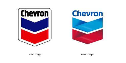
A few weeks ago when reading Wired magazine I noticed a rather scary ad by the company Chevron . It was an ad for their new site called willyoujoinus.com which is some kind of feel-good-PR site for Chevron. It’s about how we have to chill out with our extensive use of oil. As Tom Harrison puts it:
”The pessimist in me says that any company that is paying big money to say ’do whatever you can to stop buying my product’ is in deep trouble.”
Anyway, what I find a bit scary is the whole re design of the Chevron logotype. By just adding some shadows on the arrows the logo has transformed from being an evil gas company logo to something very kind and gentle. The two lines has turned in to two cute ribbons and everyone know what ribbons symbolizes: awareness for different social causes, etc. So, god dammit, the designers over at chevron’s done a clever move!
Update 2006-10-16: There is an interesting thread about my post and the re design at typophile.com.
i think the chevron new logo is better look.
thq.
/Didit Prasetyo B 2007-08-24, 12:44
I agree. These types of PR stunts work so well in a country like the US, where we eat whatever’s fed to us.
This article will jangle your conscious nerves a bit more: http://www.democracynow.org/article.pl?sid=07/10/12/1454252
–werd
/werd 2007-10-24, 20:48
Thanks ”Werd”. It’s a pretty nasty story though..
/oskar 2007-10-24, 23:06
brilliant initiative …chevron rocks
/Adekunle Samuel Owolabi 2008-10-16, 07:46
I should admit I’m fascinated with the new Chevron logotype, because the new details make it looks more interesting and modern. I don’t know from where the designers took the idea, but there are not doubts they made a stupendous job.
/Kamagra 2010-10-28, 15:46
I think the new logo looks better. It has the modern touch. It’s like Pepsi and Xerox who have also changed their logos.
/Logo Design 2010-12-03, 11:48